8 weeks
Grow is a mobile app that helps maintain mental health so that working students can alleviate their everyday stress and exercise mindfulness. Unlike other apps aimed towards mental health the product provides a unique gamified personal growth experience.
As of 2021, the COVID-19 Pandemic has been rampant for over a year. In an effort to slow and eventually cease the contagion, governments have ordered lockdowns across the world. The damage to productivity and thus the economy has been dramatic. As various industries and organisations adapt to the enforced self-isolation, working from home has become the prevalent workspace wherever possible. One year in, it's fair to say that many organisations have managed to adapt.
Yet, it is also clear that working from home brings a lot of its own issues:
These issues are just as prevalent for students. Students who are forced to study from home rather than on a campus. In fact, in many ways, you could argue that a student has an even more stressful time than the standard employee:
That is why our team Rebecca Baihaki, Nina Skornia, Ieva Gvazdaitytė and myself, have decided to tackle some of the problems facing working students during the pandemic, specifically the lockdowns.
Unfortunately, this topic is a colossal issue in terms of both scope and weight. It is highly unlikely that the four of us could identify the real crux of the problem and find a simple cure-all solution. Especially given that none of us has expertise in psychology or other notable related fields.
Therefore, rather than tackling the problem directly. We have chosen to try and conceptualise a 'digital intervention'. If we can bring a small respite to support a student's waning focus, motivation and confidence in these trying times, that would be a massive success in our book.
We had only two months to produce a functional prototype which we could test and learn from so being overly ambitious was not an option.
I observed a masters student preparing a presentation with the purpose of introducing a masters project to her professor. Depending on the professor's opinion of the project proposal, she would be given approval to work on that project. The student had already completed the detailed presentation, but was attempting to examine it looking for any potential improvements as well as be prepared to actually go through it when the time comes.
The student's primary worries were whether the presentation would be easy to understand, delivered in the appropriate time frame and as an introvert communicating under pressure. In an effort to overcome these concerns, the student was extremely thorough in her preparation. Checking through each slide individually multiple times and timing herself presenting the entire slideshow until she was content.
I interviewed a fellow student of mine Velko Stoychev, with the purpose of learning what his experience of online learning has been like. I discovered that he has had both some positive and negative experiences due to online learning. Being able to study from home has given Velko much more financial freedom than he would normally have. He's been able to study in his home country from his parents' place in Bulgaria. This was the primary positive takeaway.
On the other hand, the online learning experience has left him feeling uncomfortable voicing his opinion in class and he has also had many technical difficulties disrupting the lecture. This combination has led to sometimes not completely understanding a topic but keeping that to himself rather than speaking up about it.
Please find the following link to see the full results of our interview here (template provided by lecturer).
What I learned
From this user research, I discovered that students are often very self-conscious and shy. Being isolated from the rest of the class and thus not being able to share their difficulties only exasperates the issue. From my own personal experience I can say confidently that sharing your problems with others going through the same thing is very cathartic and this hasn’t been an option for the majority of second semester students.
What I want to find out
How can we help students feel more comfortable in their own skin, to the point that they communicate their issues online with others. Rather than bottling them up and keeping it to themselves. Is there any precedence for this? Or perhaps a known method to reduce stress in a difficult environment?
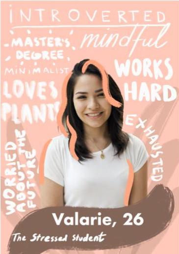
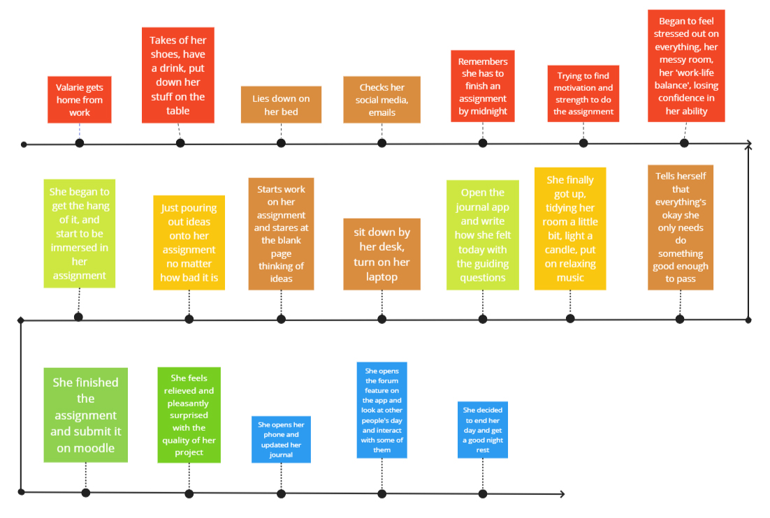
"As an introverted, busy, stressed, broke student who's struggling with mental health but doesn't have much time to talk about it deeply with anyone nor affording a therapist, I need a platform where I could map out my feelings and also receive support from anyone that's experiencing the same, so I could be more aware of what I'm feeling". ~Valarie
To meet our persona's goals, our solution must:
How could this thing work? What other ideas have been discussed and why aren't we pursuing them?
In an attempt to solve the problem, as a team we produced three different solutions:
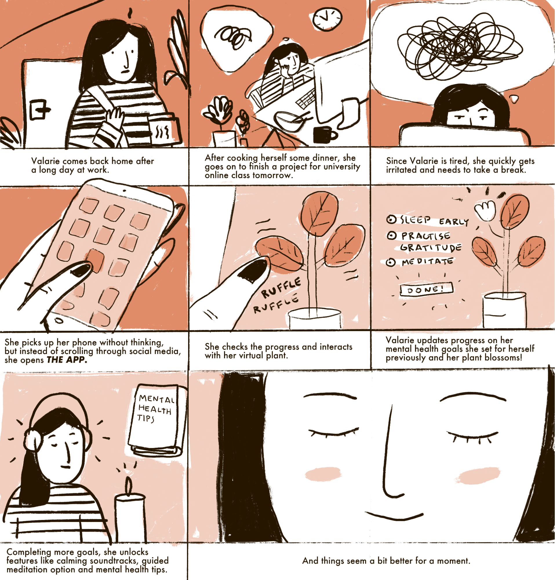
As a group, our clear favourite was the third concept, the plant app. It has a unique spin on the note tracking and mental health app space. But also, has a stronger more meaningful purpose toward multiple uses. The first two apps aim to connect you with like minded people with similar issues. But, this is actually already possible by simply connecting with fellow students in your course. The real issue is having the confidence to take that first step.
That's why an app which encourages you to make progress on your goals might well be more effective at helping students develop the support network that they need. Being able to see and track your progress will lead to a more comfortable and confident student. But, they can reach that point at their own pace without judgment.
Additionally, we presented our three concepts to the class and gave them a poll in order to vote for their favourite. In this poll, the plant won by a landslide with over 65% of the vote.
We developed a complete information Architecture for the Grow application as a group.
However, we didn't test or wireframe these low-fi prototypes due to time restraints. This would come to cost us later in the project as some basic features were missing with our high-fidelity prototype.
After doing a competitive research at successful stress relieving applications such as Headspace and 7mind I found that it's very common for these applications to provide lengthy onboarding processes. Therefore, I completed a separate information architecture for Grow's onboarding process.
The purpose being to ease new users into our application given that the product is quite unique. Plus, to give people options as they enter the application similar to what I had seen in our competitive research.
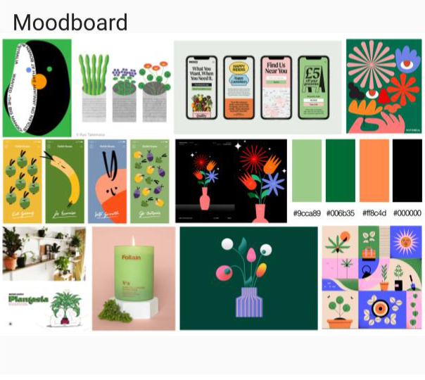
For the most part, our prototyping went entirely smoothly because we had such a clear, unified vision for what our plant-based app would be. Not just from a feature perspective, but also in terms of branding and feel. I believe that this was partially because we had such a strong connection as a group to our persona Valerie.
You can find the latest iteration of our prototype below (Fullscreen only available on Desktop).
As a group, we performed a user test on another team to identify any areas of improvement. The concept and aesthetics of the app were very well received. In addition, many small features like tips were highly appreciated. However, although for the most part the group went through each feature without any issues, actually finding them proved to be more difficult than it should be. In addition, Muhammed brought up the problem that he cannot redo any decisions he makes in the onboarding process if he wants to. A feature which we had overlooked.
You can find our preparation/listed results of that user test here (template provided by lecturer).
Grow takes a psychologically proven mental health benefit - growing plants and connects it with your mental health progress. Encouraging students to stress less, sleep soundly and be proud of themselves . So that they can tackle the challenges of being a student throughout the pandemic with hopefully a little less panic and their heads a little higher.
If this project was continuing, the first step I would take is to actually go back to the low-fidelity/wireframe stage of the UX process. By skipping this we left a lot to be desired in terms of user friendly navigation and missed basic functionality which is a must for the product.
In addition, I would argue that though our high-fidelity prototype is aesthetically pleasing, there are many inconsistincies throughout it. To address this I would create a design system following the atomic design methodology. This would allow people to become familiar with our product sooner which I believe would positively impact their navigation experience.
Please reach out if you'd like to learn more about my work.