
Qficiency Stylescape: The Professional
Three weeks
Qficiency is a startup specialising in the project management of custom heat pump technology implementation. They offer more than 20 years of professional experience in the space, proving invaluable to companies looking to improve their sustainability. Qficiency wanted a logo which would establish them as leaders within the space while remaining true to their industry and professional values.
In order to deliver a logo which would meet the set requirements I performed a competitor analysis. With the objective of identifying design trends (colour, typefaces, visual style and the overall vibe) within this niche field.
Once the design trends had been determined, I produced three stylescapes to present to Qficiency. The stylescapes purpose being to visualise Qficiency's identity and ensure that we are all on the same page.
Next I developed and presented three logo concepts to Qficiency. One of which was chosen to go through a round of final feedback and iteration. From which the final logo has been wrought.
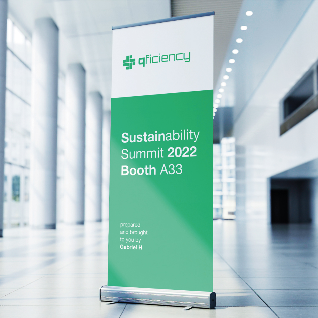
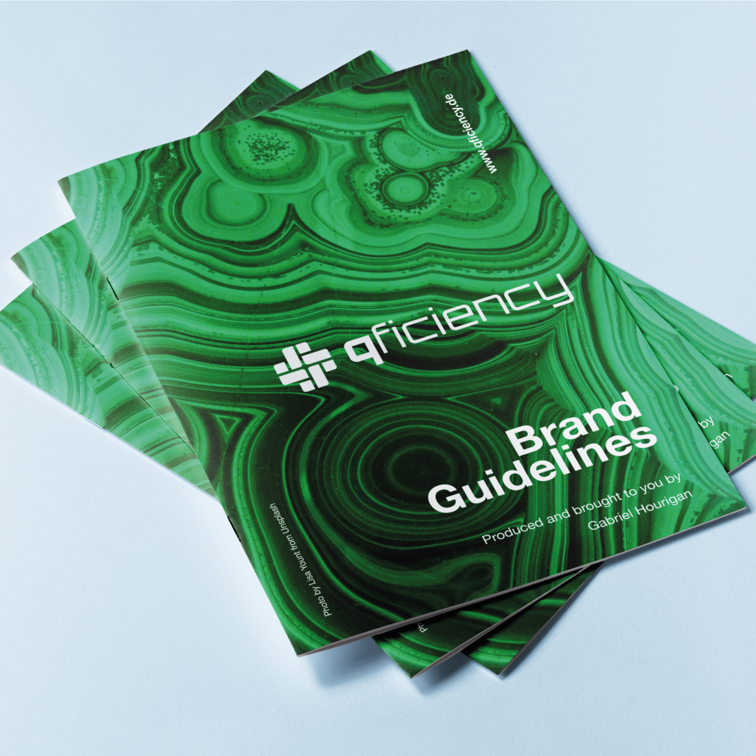
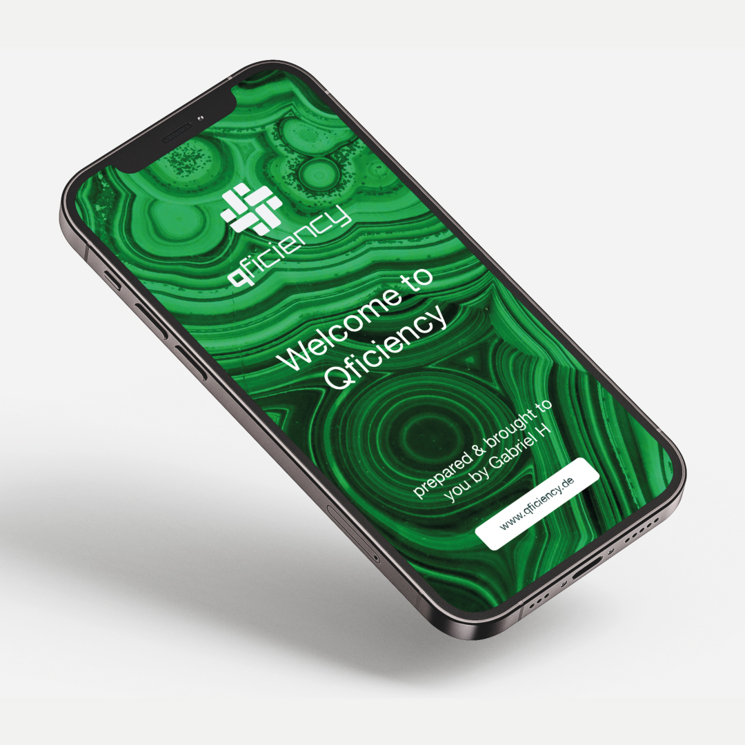
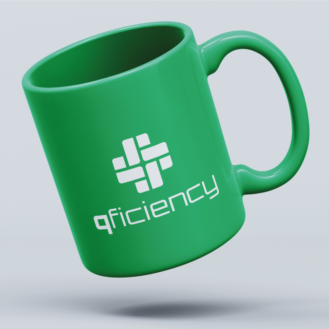
Finally, I put together a complete brand guidelines document on how to use the logo. Complete with colour codes, typography, do's and don'ts and mockup examples.

Qficiency Stylescape: The Professional

Qficiency Stylescape: Friendly, reliable

Qficiency Stylescape: Mechanical Excellence
The infinity knot represents the infinite energy provided by the power of Qficiency.
The mark has been created through the combination of our typeface Orbitron's q glyph and the infinity loop icon.

Please reach out if you'd like to learn more about my work.