Resume About Work

PRODUCT DESIGN

trivago

VIEW PROJECT

Opportunity: I would like to enter my preferences fast and easily

Potential solution: Add the pet filter to the guest selector

Key assumptions:

  • Users discover our pet filter easier
  • Users will apply the pet filter more often when it's in the GS
  • Users who don't need the pet filter won't be distracted by it
  • I spent half of 2022 having an absolute blast working in a hybrid set-up at trivago HQ in Dusseldorf. Where I completed a mandatory internship for my information & communication design Bachelor's degree. This is one of multiple projects that I worked on in an effort to learn about user intent through UX research with the purpose of improving the search experience at trivago and help users move down the funnel.

    Over the course of 3 weeks, I worked on improving access to non-negotiable criteria for travellers with a focus on the guest selector. This included ux research, competitive analysis, high-fidelity wireframes, interaction design, ux writing and testing which confirmed that the validity of the design. All with the aim of make accommodation search more efficient and intuitive.

    Check out the end result at www.trivago.com.
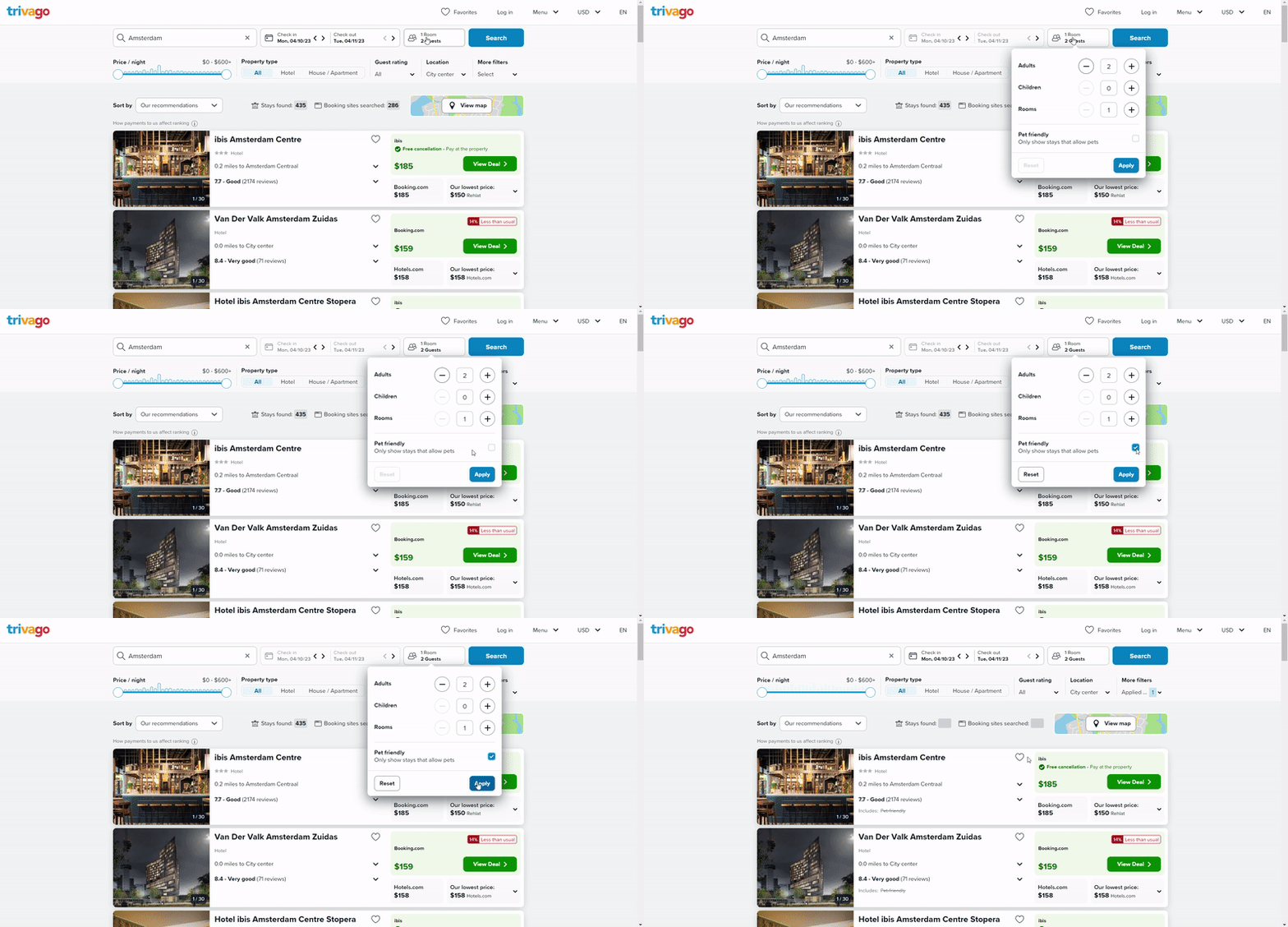
    Animated GIF showcasing the 
      pet guest selector which Gabriel Hourigan designed during his product design internship.

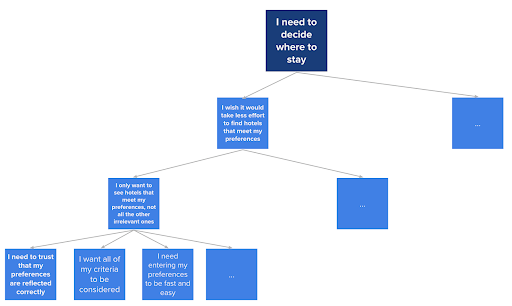
    During our qualitative research the Search & Flow team discovered that many travellers stated issues like "I wish it was easier to find hotels which meet our preferences", "I only want to see hotels that meet my preferences, the rest are irrelevant" and "I need to trust that my preferences are reflected accordingly."

    Through our discussions we came up with a lot of different solutions to those problems. So we had to make decisions on which to prioritise. To do this we used assumption maps to decide how important it would be to test various solutions. From there, we prioritised speed. Speed was the focus in terms of giving travellers the results that they are looking for quickly. But, we also focused on speed from a development and design stand point.

    With that in mind, my product manager encouraged me to take on a solution for a relatively simple solution which we had thought of. Adding a pet-friendly filter to our guest booker.

    Oportunity Solution Tree, for trivago
         I need to decide where to stay.

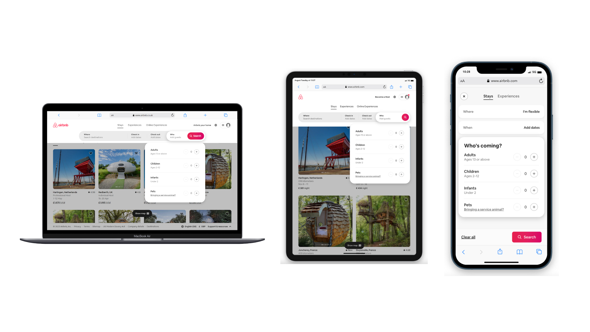
    I started by documenting insights into trivago's competitors in regards to how they implement, display and promote their additional features in their Guest Selectors. Generally, when performing a competitive analysis I'll look into other industries work too. But, in this case guest selectors are quite a niche feature and are really only travel specific. Reference images have been tested via mobile simulator on the following devices:

  • Macbook Air
  • iPad Pro 11
  • iPhone 12 PRO
  • Airbnb competitive analysis of guest 
      booker. The image includes three different viewports; mobile, tablet and desktop.

    Through the competitive analysis, we identified that adding specific guest-related criteria such as pets or cribs could help travelers narrow down their search results quickly. As a result, we decided to implement a pet filter in the guest selector to cater to the needs of pet owners and make it easier for them to find suitable accommodations. This not only addresses the needs of a specific user group but also improves the overall search experience for all users.

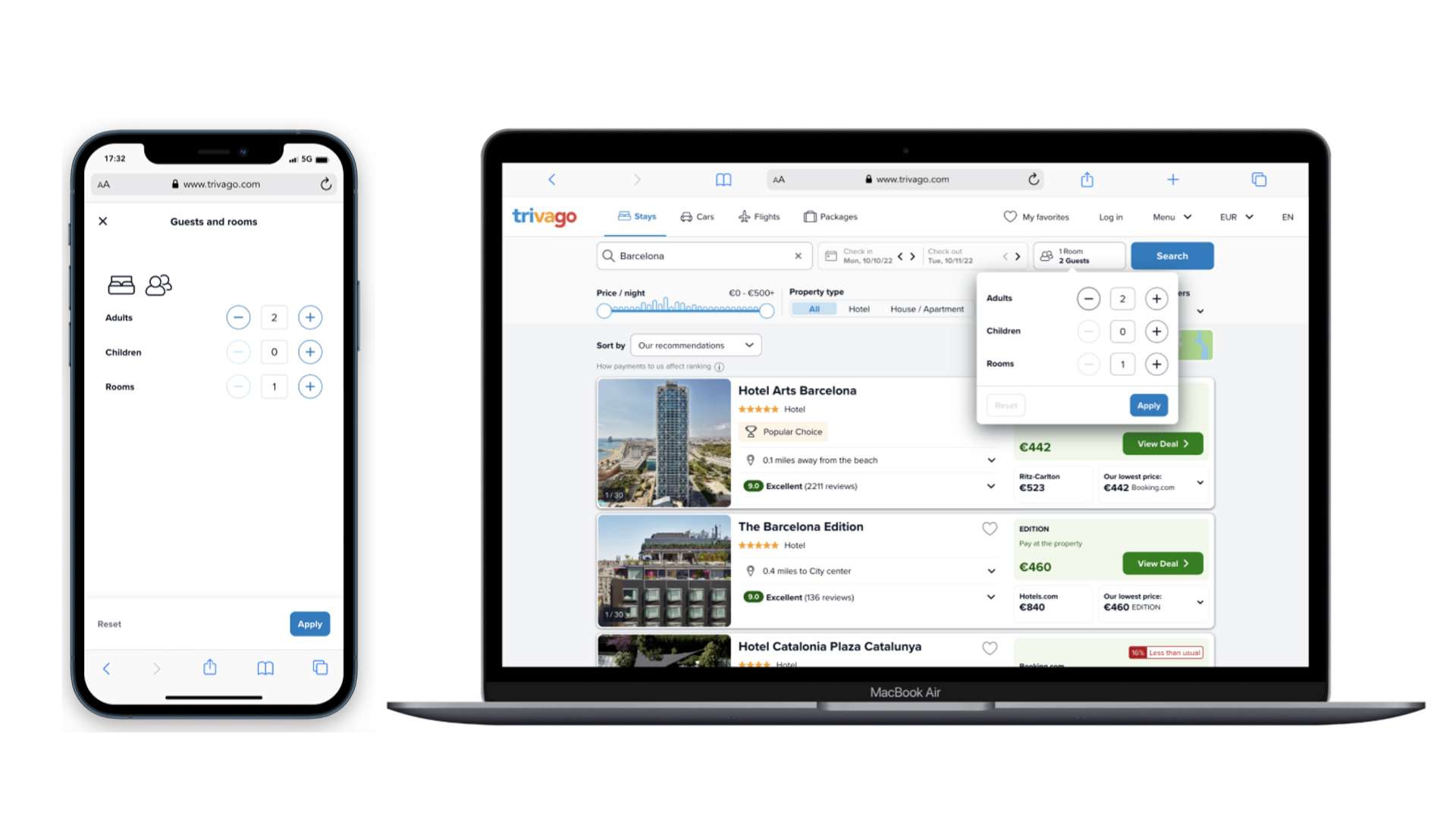
    At trivago designers generally go straight into high-fidelity prototyping unless there is a very significant departure from the current product. However, in this case where I'm making only a minor alteration to the experience in terms of UI it definitely didn't feel necessary to sketch out ideas given that trivago has a solid design system in place which provides an easy starting point.

    The previous guest selector 
      before this project.

    Previous design of the guest selector before this project.

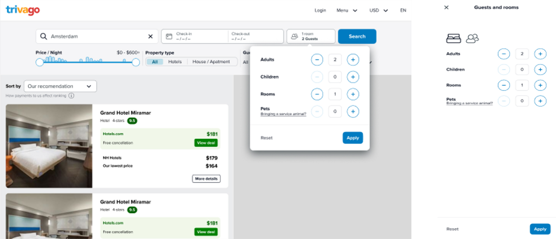
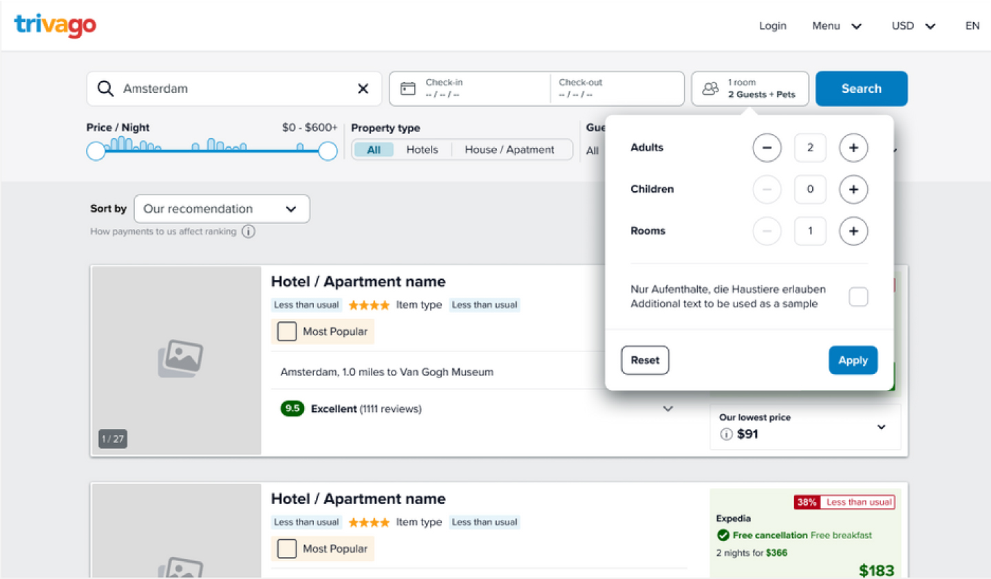
    My initial direction was to follow Airbnb's footsteps based upon the competitive analysis which I had performed earlier. Adding another counter for pets, so that travellers could state exactly how many a hotel should expect from their booking. However, I quickly learned that trivago doesn't have the data required to refine results based on the amount of pets allowed at an accommodation. Therefore, we can only provide easier access to the pet filter rather than a new feature entirely.

    The intial design of the 
        pet-friendly guest selector, adding a counter for pets on the trivago website.

    The intial design of the pet-friendly guest selector, adding a counter for pets.

    I skipped the mid-fidelity wireframes and went straight to high-fidelity designs in Figma, as trivago already had a well-established design system that I could leverage. This allowed me to generate a range of design ideas and iterate on them later in the process.

    high-fidelity designs in Figma

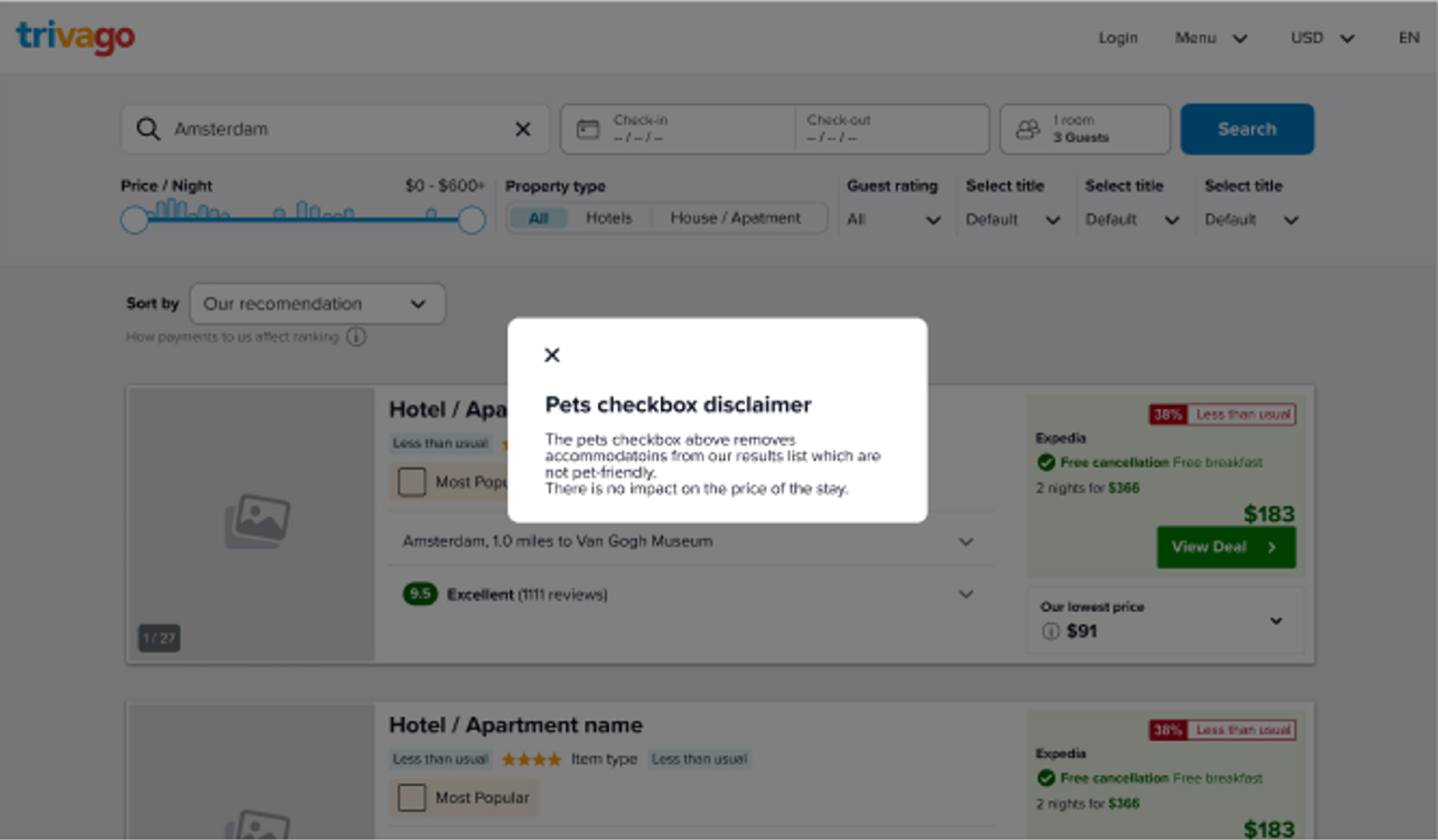
    Something which I had to consider was whether or not users would recognise the distinction between this filter and the guest counters. Starting with changing the input from a counter to a checkbox I worked on multiple methods to communicate to travellers what exactly is happening when they tick that box.

    Pets checkbox disclaimer interaction.

    A popover with text used as a pets disclaimer.

    I also collaborated with a UX writer, taking and giving suggestions for the accompanying copy for this design. As well as setting a character limit on translations for the copy to ensure that the design remains consistent across all of the different languages which the product, trivago is offered in.

    German translation of the 
        guest selector with the pet-friendly filter.

    A design with a German translation of the guest selector with text for the pet-friendly filter.

    As part of the project, I collaborated closely with a UX researcher to plan and execute an A/B test to determine the most effective design solution. Through our discussions, we were able to narrow down the two design options to test and identify the metrics that we wanted to track to ensure that our key assumptions were met. Working with the UX researcher allowed me to gain a better understanding of how design decisions impact user behavior and how testing can help to validate those decisions.

    Pet guest selector design 
        to be A/B tested. This one only has a single line of text. Pet guest selector 
        design to be A/B tested. This one has a Title and sub-title to clearly represent it's information.

    Although I don't have access to specific metrics (since I left trivago before our assumption tests were put into practice), I'm confident that my design solutions met the goals and objectives of the project based on the positive feedback I received from my colleagues.

    Through this project, I was able to develop my skills in user interviews, interaction design, and prototyping. I also learned that even a relatively simple design challenge should not be taken at face value and should be explored thoroughly. Plus, I got a lot of valuable experience in collaborating effectively with cross-functional teams from discussing findings from our user interviews, design critiques, frequent feedback meetings, collaborating with a UX Researcher and UX writer as well as producing a design handoff document for engineers.

    Overall, I believe this project was a success (since it has been implemented and is live), and I'm excited to apply the skills and experience I gained to future design projects.

    Learnings from the experience: important take-aways.

    01

    PROACTIVELY SEEKING FEEDBACK

    Throughout my internship a challenge I would face is identifying when what I'm working on is ready for the next step in the process. I learned that to circumvent this, I should get regular feedback from stakeholders and more experienced designers. Even beyond scheduled sessions such as design critiques. Scheduling more 1:1s allowed me to drive progress in my projects and build camaraderie with my team.

    As a result, I came to value proactivity very highly throughout the course of my internship and it's an area which I will look to continue to imrprove in.

    02

    SPEAKING YOUR MIND

    Constructive feedback is key to design. I strongly believe that getting as many different perspectives and opinions ultimately leads to a much more though out end-product which is beneficial to all involved. So despite having some imposter syndrome, it did not surprise me that my input was also highly valued from my colleagues despite being less experienced. What did surprise me however, was how willing teams were to experiment outside of design work based on people's input. From design methodologies, workflows, tools and even presentation guidelines. I realised that continuous development is important for far more than just the product.

    03

    THE EXTENT OF PRODUCT DESIGN

    One of the reasons why design and in particular UX/Product Design have appealed to me is that there is an infinite capacity for learning. By the very nature of the career path, learning about users and adapting to new technologies requires an individual to commit to self-growth which personally strongly appeals to me. I am not looking for a profession in which one can remain static. But, throughout the course of my internship, I learned that product design has more breadth than I had even anticipated. Due, to the fact that designers benefit greatly from having a fundamental understanding in many other fields with which we collaborate. Including business, data analysis, customer support, copywriting and much more.

    04

    THIS FIELD SUITS ME

    I have learned that Product Design is a field in which with time and dedication I could truly excel in. Due to my adaptability and analytical thinking I am able to provide a diligent, organised approach to address product issues. In addition, I have cemented my hypothesis that I would highly enjoy this field. Which is mostly due to the high variance of tasks and the collaboration with colleagues/interviewees with a different background than your own. Finally, I highly appreciated the opportunity to work with colleagues with different backgrounds and skillsets than my own. Not only do different perspectives provide a more complete view of the product and thus increase our chances of success. But, as an individual I greatly valued the variation of topics and discussion brought from this diversity.

    Internship Report

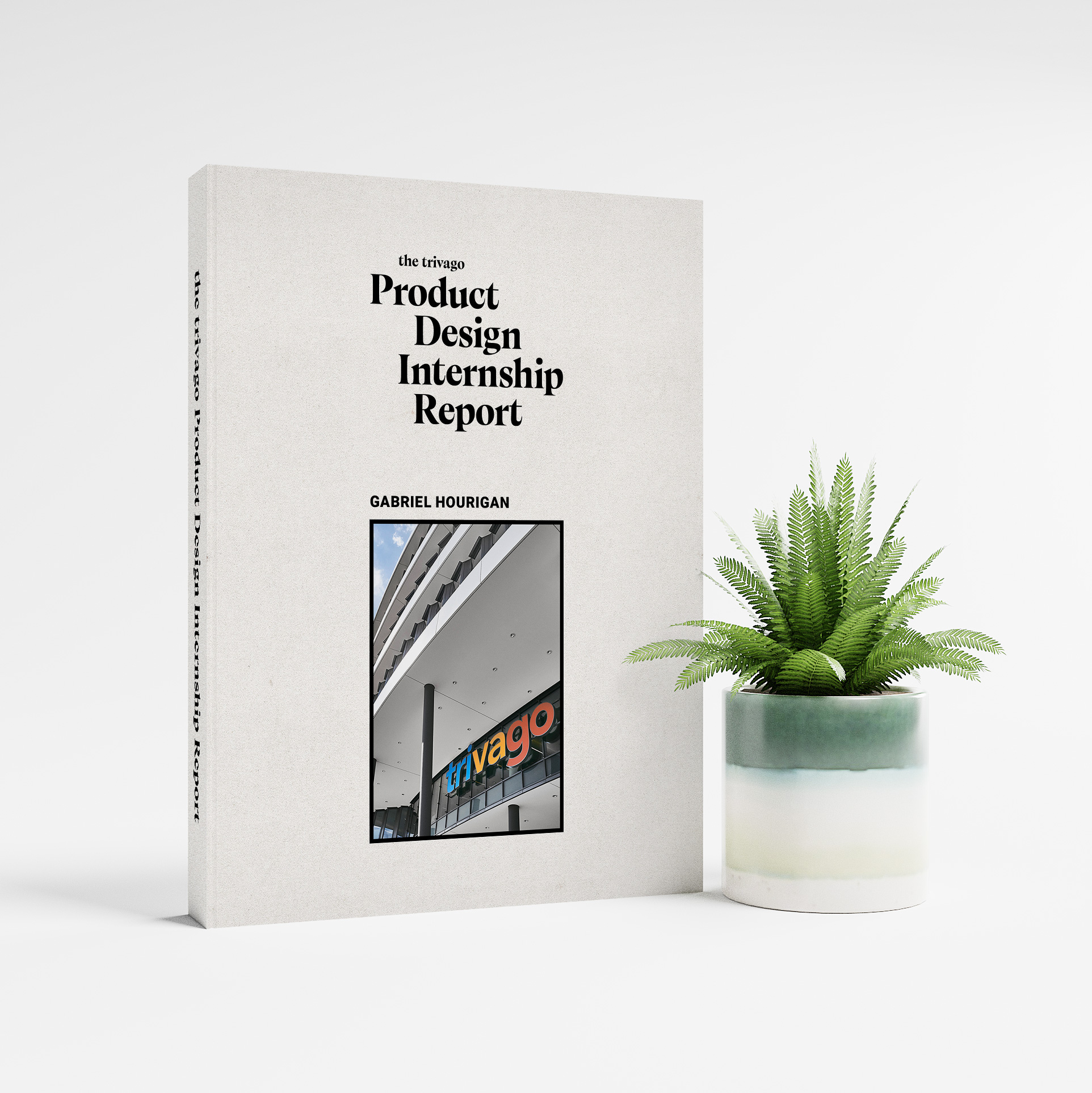
    The following internship report aims to document my experience at trivago from May 2022 - October 2022. The report was created as a part of my Bachelor's degree and was obligatory as part of my mandatory internship.
    From it you can learn a lot about the projects which I worked on, my working process, my insights regarding my future career and much more. I strongly suggest that you check it out.

    View full internship report

    Note: Open in Adobe Acrobat for the best experience.

    trivago product trio working on Mural; 
          Soren Weber, Emilio Martins, Mara Zocco and Gabriel Hourigan

    Please reach out if you'd like to learn more about my work.

    Next Project: Grow